Are you a person who loves charts because they make data interesting and easy to understand? Or are you a person who sees a chart and immediately gets stressed?
Charts should never make information more confusing. Even if you’re not someone who enjoys analyzing data, a chart should make understanding data a quicker and less stressful process. When charts are made well, they can communicate data quickly to readers at even a minimal level of data literacy. But when made poorly, charts will have even the top analysts scratching their heads.
That’s why proper color selection is essential when creating charts. Well chosen colors will make charts easy to read and data quick to be understood. Poorly chosen colors will make charts confusing and hard to understand.
1. Use colors that won’t distract from the data.
This is one of the most (if not THE most) important points to remember. The colors you select should be easy on the eyes and should make your charts easier to understand. This means avoiding glaring neon colors or colors that are very muted and hard to see.
Also, don’t use too many different colors. Too many colors will confuse readers and distract from the data being presented.

2. Don’t use colors on opposite sides of the color wheel.
One of the easiest ways to avoid confusing readers is to not use colors that are on opposite sides of the color wheel. The contrast between the colors will be too much, and it will distract from the data. Instead, pick either a cool color palette or a warm color palette.
Cold color palette:

Warm color palette:

3. Use colors that reflect the theme of the information
While you should generally avoid using colors that contrast too greatly, there are some exceptions to the rule. Using colors that reflect the theme of the data you’re visualizing can make charts easier to understand. Take this series of charts that depict which political party is most common among people with different occupations:

Because blue is the brand color for Democrats and red the brand color of Republicans, the values attributed to both parties on the charts are colored accordingly. Since those brand colors are widely known, readers are able to look at the charts and immediately understand which value belongs to which party, without the need for an actual legend.
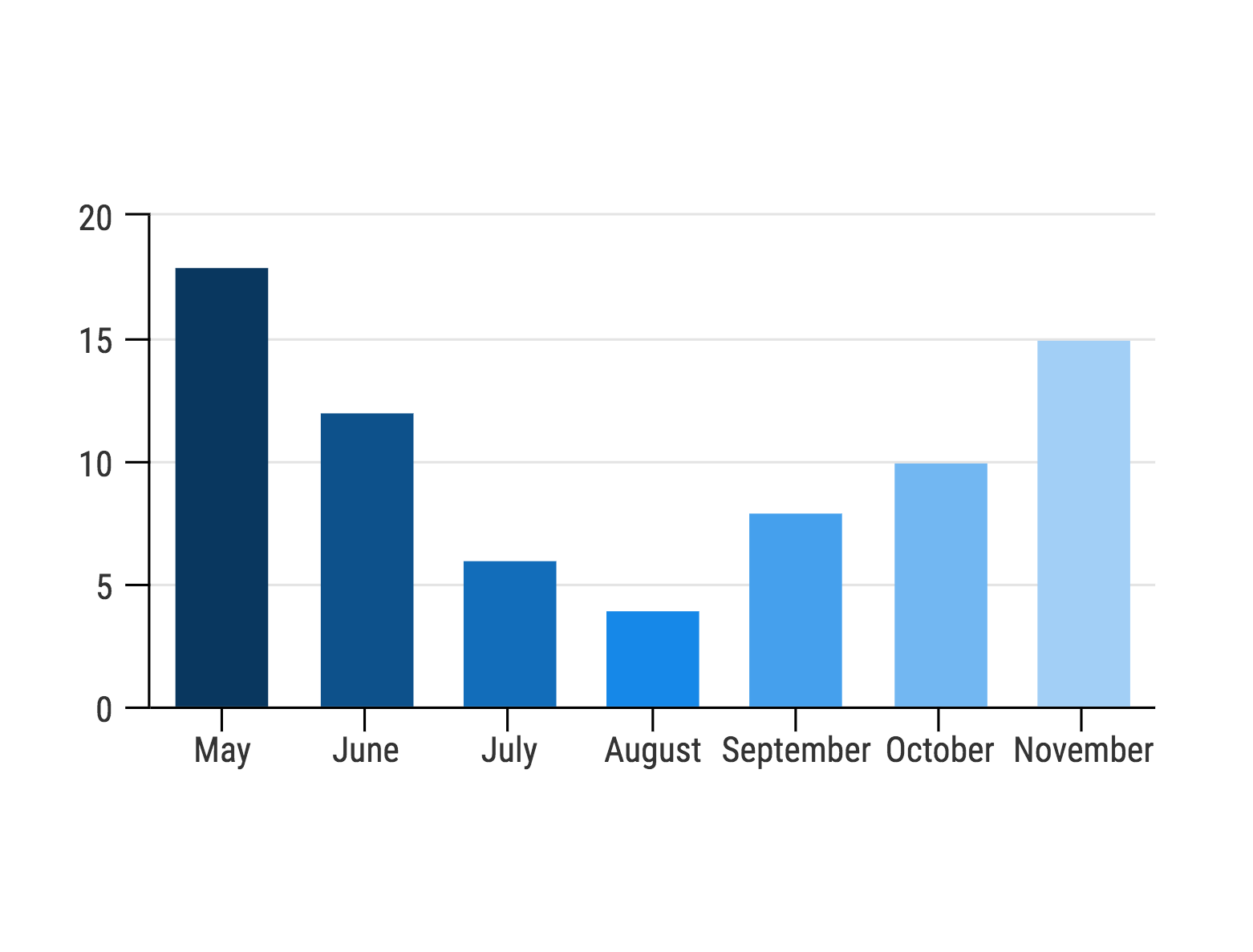
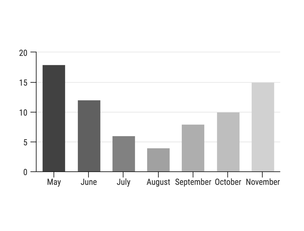
4. Use shades of the same color to show different values
Create a uniform appearance by coloring the sections on a chart with different shades of the same colors. This way, readers won’t be distracted by the colors and will be able to focus fully on the data. That being said, don’t alternate abruptly between light and dark bars or sections in the middle of the scale; instead, have the colors progress in a gradient.
5. Keep colors consistent throughout your article/report
This is a basic principle of good design that is worth repeating: keep the colors you choose consistent. For example, don’t color one chart green and another one blue. Or, if your chart contains multiple colors, keep the color scheme consistent across all of the charts. Not only does this create a more cohesive design, it also makes it easier for readers to read the charts. If readers know that one color corresponds with one category of data, when they see the color used again in a different chart, they will understand immediately that it represents the same category of data.
6. Use bright colors to emphasize important lines
While it’s important to not let color distract from the data, sometimes you want readers to focus on one particular data point. In that case, use one bright color to distinguish one line, section, or bar in a graph from the rest.
7. Use a darker shade to highlight a particular segment
Similar to the last point, if you don’t want to use an entirely different color to emphasize one point on a graph, you can use a darker shade of the same color.
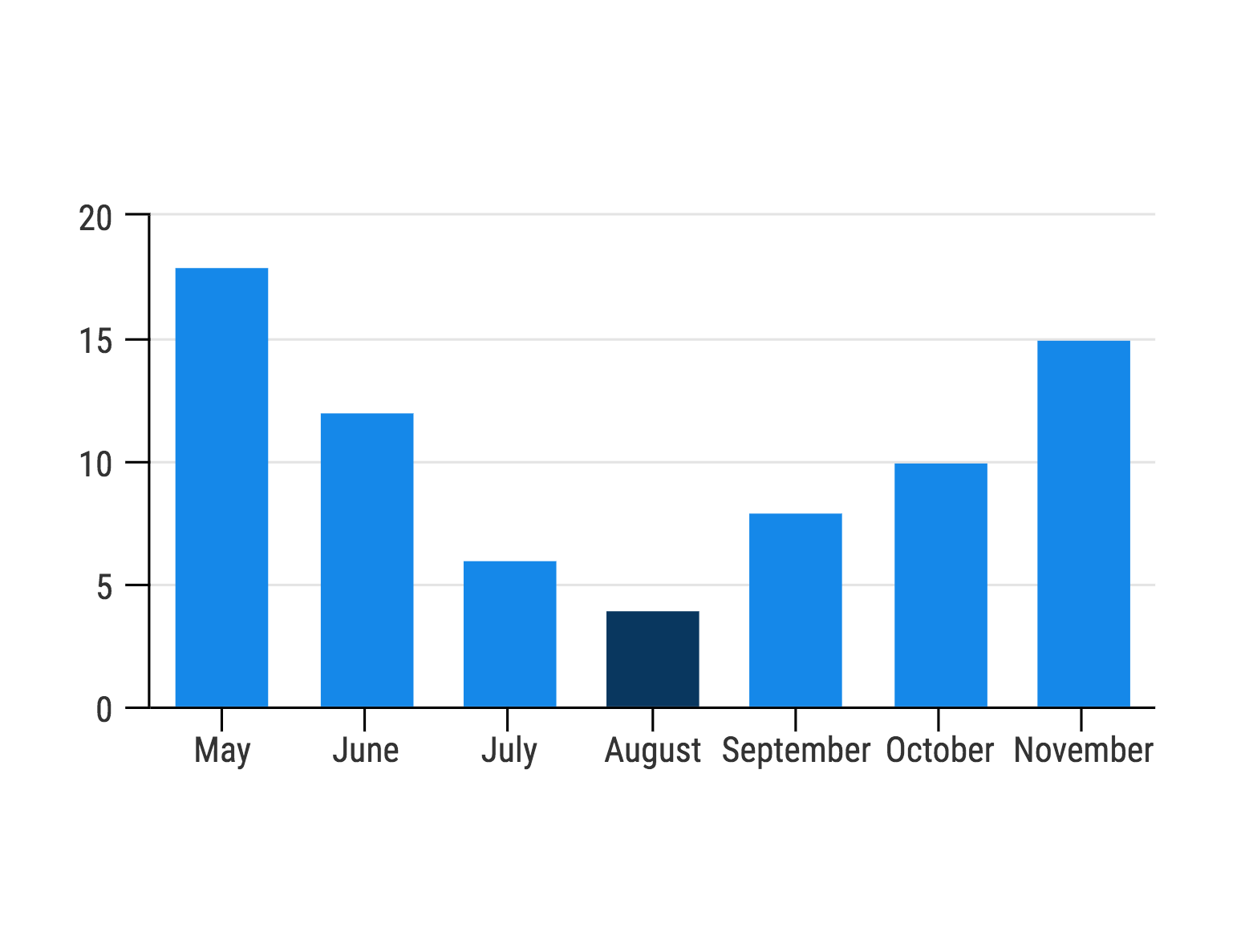
This method only works for charts where each point is separated–i.e., it wouldn’t work on a pie chart where the sections are all attached, because they would just blend together!
8. Avoid using a legend that relies on color alone
This point is particularly important if you want to ensure that your charts are readable for the color-blind. General readers may already have difficulty distinguishing between the different colors between different colors in a legend. The task will likely be only more difficult for color-blind readers.
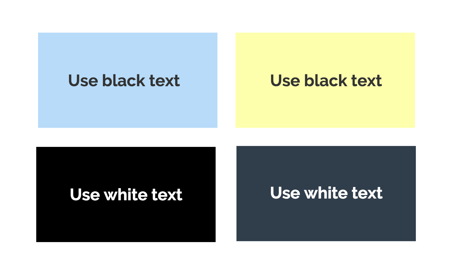
9. Use black text, unless the background is black
Generally, black text is the easiest to read, unless the background of your chart is black or another dark color. In that case, use white text. But for most situations, black text is the easiest for readers across the board to decipher.
10. To test the differentiation between colors, convert to grayscale
This is a simple and effective trick to test if the shades you have chosen are different enough for anyone to distinguish. You can make your image grayscale in Word by going into “Format Picture,” “Picture Color” and then adjusting the Saturation to 0%. If you can’t distinguish certain sections of your chart from the others once you’ve put it into grayscale, you will know to change the colors so that the difference is more noticeable.
Remember, while selecting the best type of chart for your data is important, the actual design elements within the chart are equally as important. Keep these chart color tips in mind and you’ll have no problem creating beautiful and functional charts.
Featured photo credit: Unsplash via unsplash.com