Typography is the visual representation of the written word; though if it’s used effectively, it can also add meaning to what is being communicated. Good typography is more than just choosing a favorite font. It’s setting and arranging type in a way that is legible and pleasing for viewers.
With web and mobile being the dynamic force that it is today, there’s a great opportunity to explore more brand-forwarding typography. A company’s website is commonly the consumer’s place of interaction with the brand, so being able to have type function in multiple platforms is becoming increasingly important.
– Cristin Burton, Graphic Designer for Bigstock
If you want to efficiently make typography one of your skills, without having to become an expert web designer, there are plenty of resources to help you master the art. Follow this guide that takes you through a weekly process of becoming a great typographer in one month.
Week 1: Learning the Basics
To use type effectively, you need to gain a firm understanding of the anatomy of letters and the way they interact with each other. This includes knowing the different parts of a letter and the way fonts are classified.
Typefaces and Fonts
First, you should understand what differentiates these two terms. A typeface is a set of distinct characters with varying weights, which ultimately make up a font family. A font is one set of character styles within the typeface. Basically, a font is a particular size, weight, and style of a typeface, while a typeface is a range of fonts that share an overarching design.
Typeface Styles
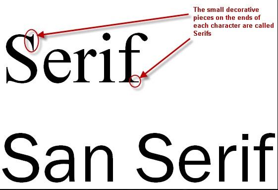
Typefaces are classified into different style categories to help define what they’re best used for. The most common and basic classification is serif and sans serif. A serif is the small stroke that stems off of the ends of letters, and a sans serif font does not have these strokes. Sans serif fonts are usually easiest for web reading, and serifs are great for titles or making bold statements.
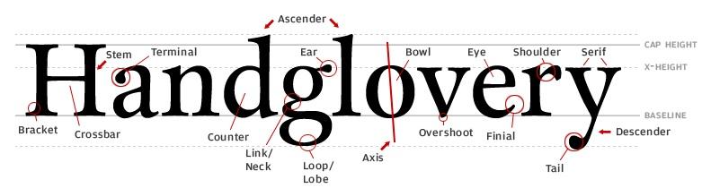
Structure of a Letter
The variations in the parts of letters are what make up different styles of fonts. Each font has its own set of unique shapes and sizes of parts. Some of the main pieces you should know are:
- X-height: The height of a lowercase x, or the height of any lowercase letter excluding the ascender and descender.
- Baseline: The imaginary line that a set of characters sit on to help create uniformity and legibility.
- Ascender: The part of a letter that extends above the x-height.
- Descender: The part of a letter that descends below the baseline.
- Counter: The enclosed spaces within letters.
Resources
These lessons and tutorials will help you gain a deeper understanding of the basics of type.
- Web Typography 101
This is a brief lesson on font types and an introduction to character spacing. - A Crash Course in Typography: The Basics of Type
This course takes you through the basics of character anatomy, type classifications and how styles can affect meaning.
Week 2: Combining and Modifying Typefaces
Anyone can simply choose a font that seems to suit a particular project. But if you want to really add meaning to your project and customize a font style to optimize its effectiveness, you need to learn techniques for combining and manually adjusting different styles.
Combining Typefaces
Combining typefaces can add depth and interest to your project that keeps your viewer’s attention and keeps the eye moving. There are certain principles that need to be considered when putting these combinations together to ensure a unified and complementary style.
Contrast: Your chosen typefaces need to be unique enough to be recognizably different, yet not so different that their styles clash. You can find this balance by making variations to weight, size, structure and color.
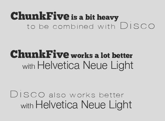
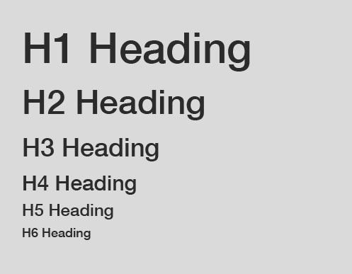
Hierarchy: Besides the actual style of your typefaces, you can create contrast by establishing a visual hierarchy that helps guide the viewer’s eye.
Modifying Typefaces
Each font has a built-in space setting to establish its structure. However, sometimes the spacing isn’t right for a certain layout. You can fix this by adjusting these spaces, known as leading, kerning and tracking. Leading refers to the distance between baselines in a block of copy, kerning is the space between two specific letters and tracking is the uniform spacing between all letters in a text. By slightly changing these settings, you can make your layout more legible, aesthetically pleasing and meaningful.
Resources
- Typography Tutorial: Leading, Kerning, Tracking
Follow this tutorial to learn more about character spacing and how to successfully apply modifications to your type. - A Crash Course in Typography: Principles for Combining Typefaces
This is a more in-depth guide for effectively creating contrast by combining different typefaces. - Five Simple Steps to Better Typography
This guide leads you through the more technical details of making sure that blocks of texts are legible.
Week 3: Layout
Even if you’re putting together a simple, text-based document, intentional layout can mean the difference between readers digesting the entire content, and moving on to something more interesting. Variations in fonts and font styles, white space and proper leading, kerning and tracking all contribute to an aesthetically pleasing project.
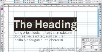
Grids: A helpful way to develop a solid layout is to use a grid system, which enables you to find consistency in spacing and alignment. InDesign has a great grid feature that is easy to use and prime for laying out and customizing type.
Resources
- Make Use of Grids for Typographical Layouts
This is a step-by-step guide to help you navigate grid usage.
Week 4: Getting Creative and Using Visual Hierarchy
As you advance in your typography skills, you can begin to experiment with more unique and creative layouts, and even customize your own lettering. Once you’ve gotten a grasp on how to create a solid layout, you can begin to experiment with different ways to make a visual hierarchy that keeps readers’ interest.
Hierarchy: Keep your target audience in mind when testing different layouts and typefaces, and consider whether your solution meets their needs and expectations. For example, it might not be most effective to use a highly decorative font for a project that is meant to portray a trustworthy and professional brand. Use what you’ve learned about combining typefaces to create different hierarchies.
Lettering: If you’re especially ambitious in your journey to become good at typography, consider trying your hand at lettering. This is “the art of drawing letters,” though it can also all be done on the computer (usually in Adobe Illustrator).
Resources
- Creating Exciting and Unusual Visual Hierarchies
This will help you learn how to create new hierarchies with size, space and combinations. - Understanding the Difference Between Type and Lettering
Develop a deeper understanding of both these practices and decide how far your typographical ambitions run.
You’re Ready!
Now that you have your typography lessons planned out, you’re ready to get started! By the end of the month, you’ll be well on your way to becoming an expert typographer, making all of your projects easier and more effective in communicating to audiences.