If you’re at all familiar with Microsoft Excel, chances are you’ve used it at one point or another to organize and present critical data. And chances are you’ve thought to yourself, “There must be a better way.” As it turns out, you were right. From charting global statistics on malaria to creating stunning charts and graphs or crafting maps that tell a story, here are 7 data visualization tools you should be using right now.
1. Nuvi
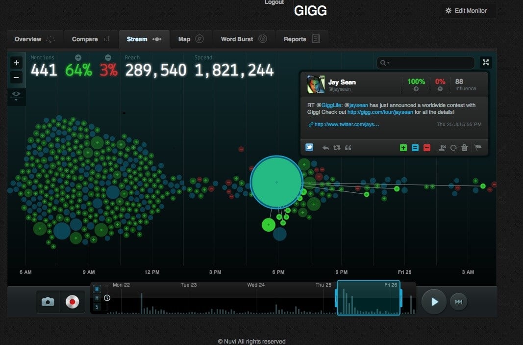
Nuvi is a tool that lets you see what’s happening, in real time, on social media. Keep track of followers, engagement and comments in your Facebook, YouTube, Twitter and Instagram accounts to stay ahead of the game in your industry. Their bubble stream view allows you to see social interaction going on in real time. The bigger the dot, the more influential the entity. Green represents positive sentiment, red negative, and blue neutral. Use these patterns and insights to tailor your decisions to get the most returns on your investment.
2. Exhibit
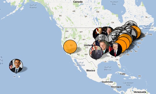
Created by MIT, Exhibit lets you quickly and easily create web pages with charted worldwide data, interactive maps and historical data sets. Create a map with flags of the world, an interactive bubble flag hovering over every country. Design a map of the United States with interactive bubbles over the most populated cities—the bigger the bubble, the more populated the city. Think of some statistic or fact you want to display with some kind of map, and let Exhibit help you create it. Exhibit is maintained and developed in an open-source community.
3. DataHero
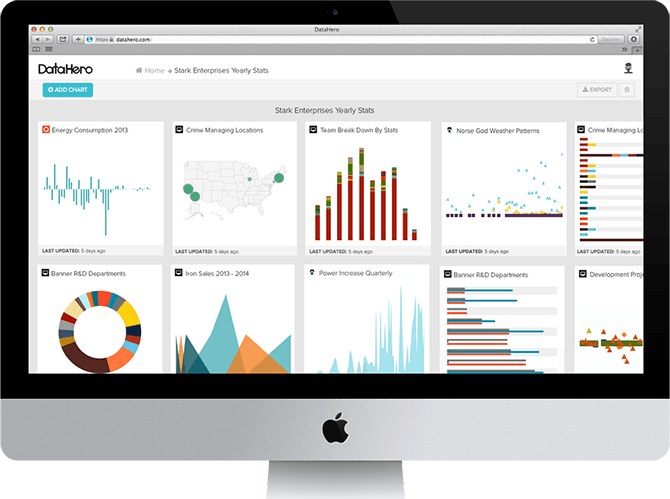
Use DataHero to chart business data and get actionable insights to make business decisions. DataHero can work with your data in almost any form, whether it’s online, in cloud storage drives, or in excel. You’ll be able to create excel dashboards, beautiful charts, and interactives that will allow you to make important decisions in real time. DataHero also connects to applications like Hubspot, Shopify, Zendesk and dozens more to make using your data with your favorite apps all too easy.
4. Kartograph
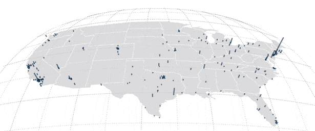
Created with the needs of designers and data journalists in mind, Kartograph is a source for building interactive maps without needing to use any other kind of mapping service. It is most useful for charting defined data, not worldwide data, and does so quickly and effectively. Kartograph gives you a lot of options when it comes to mapping information and lets you do so in compact SVG maps as well as interactive maps that run across all major browsers.
5. Visual.ly
A brainchild of former Mint.com employees, Visual.ly is a community platform for data visualizations, making it easy to create infographics, videos, interactives, presentations and micro-content. The site is both a showcase for infographics as well as a marketplace and community for researchers, publishers and designers. Create a profile, craft and publish visualizations to it, and then share the visualizations through your social platforms.
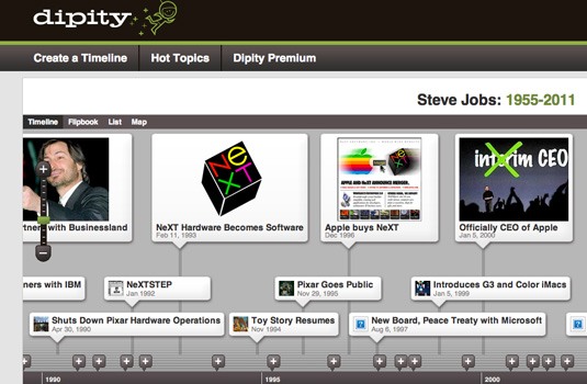
6. Dipity
Bring history to life by creating a stimulating and visually appealing timeline with Dipity. Create, share, embed and collaborate on a timeline that integrates a number of features, including image, video, audio, text, links and more. Dipity offers both free and premium versions for those with different needs. The premium version, for example, allows for custom branding and backgrounds as well as custom iPhone apps. Create a timeline and it could be featured in their “trending topics” area.
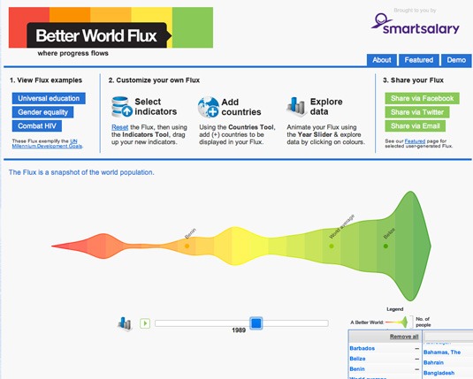
7. Better World Flux
This data visualization tool displays some of the world’s more distressing data but does so in an attractive way. Select different countries and indicators like “access to water” and “happiness score” to look at and track progress made. Though you can’t upload your own data, the data available to look at is extensive and spans decades. Better World Flux is also quick and easy to use and allows for an interesting interactive ride.
Featured photo credit: Nuvi Reviews, Price/Costs and Features via aboutanalytics.com