According to research carried out by the Institute for Color Research, between 62% and 90% of the subconscious judgments we make about a person, environment, or product within the first 90 seconds are based on color alone.
We are constantly influenced by color, as primary and secondary hues create a color wheel that can stimulate our senses, alert us to danger, remind us of our favorite brands and even shape our mood. In nature, color changes can signal the onset of a new season, or offer a warning sign to keep predators at bay. In the modern world, color can be used to inspire and express creativity or to calm and control.
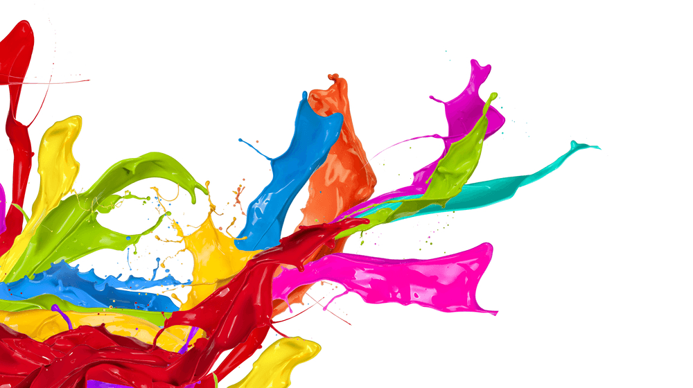
Cultural differences can also impact on how and when to use color: for example, in some countries red is favored as a choice for luck, romance or passion, but in other parts of the world it is a color for mourning. Used effectively in your home, business or work environment, or as a form of therapy, color can affect your experiences in ways that would be difficult to create by any other means. Let’s look at how color combinations and tone influence everything from psychology to décor.
Warm Colors: colors such as red, orange, yellow and brown are defined as warm, and are most often used to convey energy, passion, and strength. They stimulate the senses, especially your sense of hunger, which can be great for a restaurant branding, but less so for a living room. Be sure to use these colors sparingly in the home environment, as they can quickly tire the eyes.
Cool Colors: shades of blue, purple, green are likely to create a calming atmosphere and are ideal for use where people need to be relaxed. Cool colors are also known for stimulating creativity and restfulness, which is ideal for an office or workspace.
Color Schemes
Combining tones to create a color scheme is an effective way of building a mood or style, but it can be difficult to pinpoint which hues will work well together. There are a variety of schemes to choose from depending on your taste or objectives but common variations include:
1. Complementary: This scheme combines at least two shades from opposite sides of the color wheel and can provide an impressive contrast, however, care should be taken not to pick two equally strong hues. For example, pairing bright blue and bright yellow can be a little overpowering if not softened by white space or gentler tones.
2. Monochromatic: This kind of scheme typically takes a variety of tones within one specific color; for example, combining black with various shades of grey. When working with a strong shade like black, using it in a concentrated space may be preferable so as not to overwhelm.
3. Analogous: The combination of three colors that are next to each other on the color wheel is known as an analogous scheme. Interest is often added to such schemes with the use of tones, shades, and tints of the same colors, creating a layered effect that can work well with everything from web design through to interiors and clothing.
4. Custom: Increasingly popular but tricky to pull off, implementing a custom color scheme enables you to bring together any hues in any combination irrespective of typical color rules. Probably best attempted by those more experienced in working with color, great results can be achieved so long as you consider chroma, value, and saturation.
Making Color Work
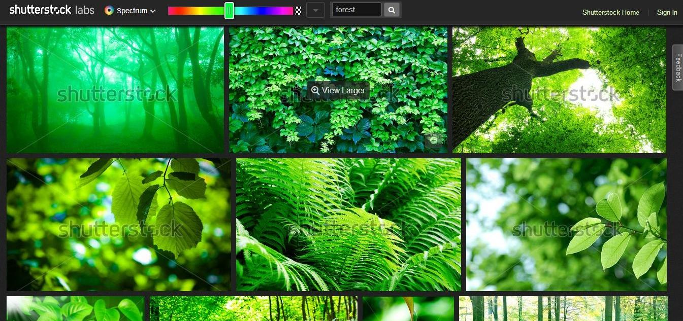
Whether you are considering color for business or personal use, you’d be wise to do your research. The internet is a rich source of information with a variety of tools available to help you. A great example is Shutterstock’s Color Spectrum. Spectrum combines a keyword search with a color slider to help you instantly group images by color and hue.
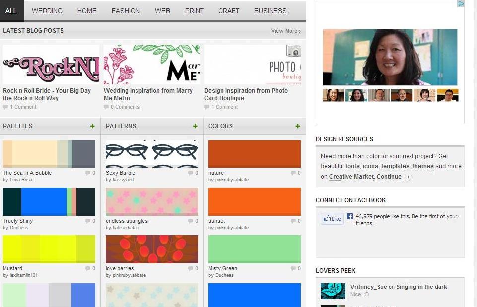
Color Lovers is a fantastic online community offering color ideas and combinations, patterns, and palettes and more for a range of uses including fashion, craft, business and even weddings.
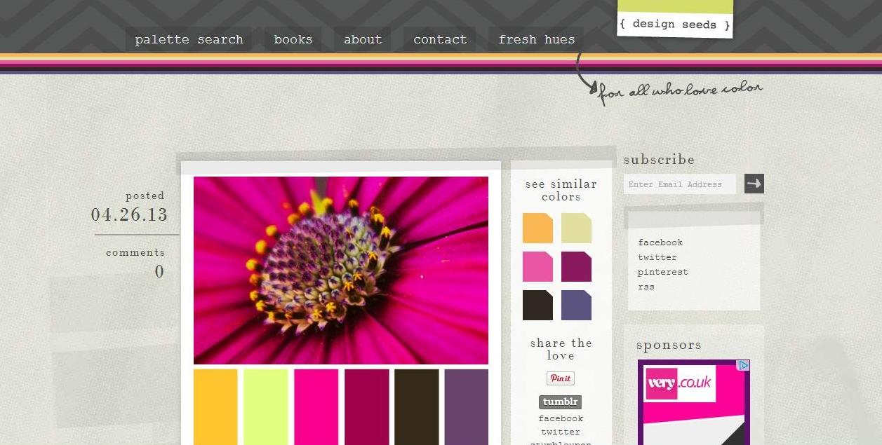
Design Seeds provides users with a quick and easy way to view color palettes and get trend information, and is ideal for interior design or branding projects.
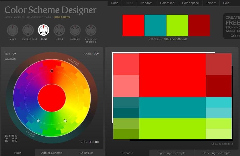
Color Scheme Designer is ideal for use by more experienced designers, offering a range of color schemes at the click of a button either at random or within your chosen hue.
In summary, use color wisely and you can create an eye-catching look that will stand the test of time. However, go over the top and you risk creating a clash that turns people off or gives the wrong message. Most of all, color is there to be enjoyed so go, explore and have fun!